Showing posts with label teal. Show all posts

Tuesday, October 30, 2012

Lovely Laundries!

Some rooms of the house are hidden away. Laundry rooms, closets, garages, master bathrooms, offices. You get the idea. These spaces tend to be forgot in terms of design too. They're usually piled up with old clothes, mismatched socks, random boxes of books, items left behind by guest, and so on and so forth. But these are the spaces we use everyday. The places we do work, pass though, etc etc etc. These rooms are often the most used. They should be designed. They should be nice. They should make make you want to be there.

So I've decided to pull up some examples of lovely laundry rooms. Bright, colorful, happy spaces that make you want to stay in the room. Places that might even inspire you to do some laundry. Maybe. Hopefully. Probably not, but let's pretend it's possible for the sake of argument. 

Here's one that looks like it could be in a lovely, little farm house in Scandinavia. At least, that's what I think. It's pretty, it's calm, it's light teal! The room is a great example of how to mix white, black, and color. The teal used here is light enough that it almost blends with the white. The black counter tops contrast with both of the other colors. Plus, I love the industrial lamp and the accessories! Big glass containers are great for holding laundry supplies in an organized and pretty way.


This is another excellent example. Also the photo has a more realistic look, because, let's face it, your laundry room is always going to have clothing in it. Year round. Everyday. Fact.

But! On to things that really matter: COLOR. This room has an amazing four color accent wall that's kinda ombre-ish. I luuuuurrrve it. I really do. Other than that, the room is basic. The other walls are white. The wood is all the same un-stained pine color. The washer and dryer are white. Simple, plain, stylish. The monogramed laundry baskets stacked next to the washer are a nice touch. The coloring on the letters matches the room. As do the hangers. My favorite part of the entire space, however, is the rug. Adorable! The painted clothes pins are whimsical and strong. I love it. I want one. This laundry room really inspires me to want to re-do a laundry room. Perhaps my parents'? I don't have one of my own...


This laundry room, while still colorful, lovely, and enjoyable, feels more grown-up. More mature. More worldly? It's definitely channeling an industrial feel with the metal wire baskets, the light fixture, and the basket. It feels like a home. There is tons of storage. This really is an ideal set up for a medium sized laundry room. The room uses mostly neutral tones-- cream walls, wood tones in the baskets, granite counter tops, brown-toned art, plants, silver baskets, brass light fixture, mostly grey rug-- however, the teal cabinetry blends in. The teal is a dusty color; it feels natural. It's close to robin's egg blue. This is why the room works as a whole, rather than feeling disjointed. A brighter, more in your face teal would not have worked. This is a great way to work color into a more "adult" space.


This is what happens when someone wealthy has too much fun decorating. This is a diva's laundry room, no doubt about it. From the sign that reads "sparkle," to the gold and black backsplash, to the zebra print rug, to the chandelier, this space screams glamour! I'll admit that it's not what I would do. But I'll also admit that I kinda like it! :) It also provides an example of how a black washer and dryer can work well in a space and not look dated. This room is huge. Bigger than my bedroom huge. Look at that work space! It's colorful, for sure. Though I think the cabinets would look better in a high gloss, rather than distressed finish. This color and finish is exactly what I have in mind for a desk that I'm planning on redoing in January though! What do you think of this room? Way too much drama? Is there anything you take away from this space?

via??

Here's a more small scale space. (Bigger than the one I grew up with though!) It's colorful and organized and shows that a small space can sometimes work better than a large one (see above!) The green is bright, but nor neon, and by mixing lots of neutrals and whites, the space feels harmonious. That laminate flooring needs to go though. I feel like this is an example of a doable laundry room though. It's not over the top, it's not overly decorated, but it works. It makes sense. It makes good use of the space and of color. This is a very real looking room. 


What does your laundry room look like? Dumping ground? Colorful? Organized? Drab? White  laminate particle board? Does it need a change or do you like it the way it is? Or do you think putting design into a utility room is a waste of time/money/effort?


Monday, June 4, 2012

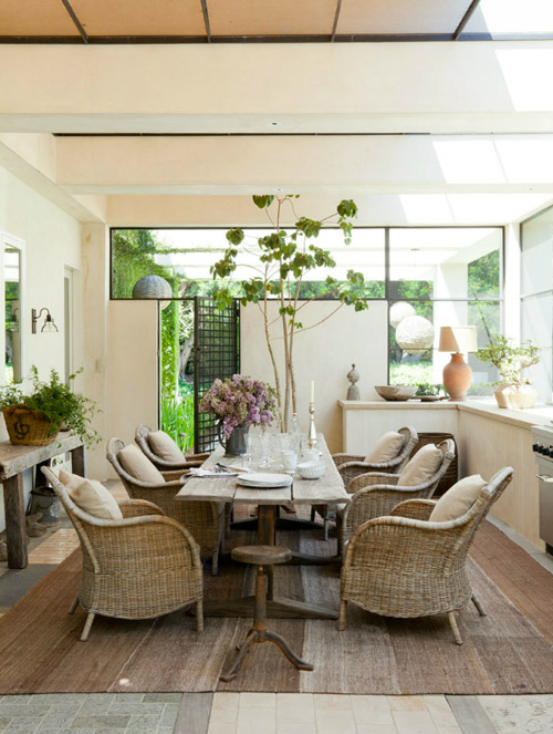
Arm Chairs in the Dining Room

You've managed to catch me on the odd day I don't feel like talking. But, hey, a picture's worth 1000 words?


??

Do you have arm chairs in your dining room? At the head and foot of the table? At the edges of a buffet? In an unused corner? Or do you prefer traditional chairs that all match?

Monday, May 21, 2012

Redoing My Parents' Master Bedroom

My parents master bedroom has always been the dumping ground. When I was young, every time we cleaned for a gathering or party at our house, a large majority of the excess stuff we had lying around was tossed into a corner of my parents room. The Good Will pile of things to be donated sat in the long hallway to their bedroom, spilling over out of its box and onto the floor, tripping passersby. Long story short. It was, and is, a mess, and they deserve better. I am home for a while this summer and have begun planning a big redesign of their room.

It started when I saw this pillow at Cost Plus World Market:


I instantly loved the colors, the pattern, and the over all look. I took a picture and texted it to my mom. She liked it too! The pillow works well with the Spanish style feel of her house and the colors and pattern are young and fun, also like her! She's also always had a soft spot for the color orange. Which probably explains why her house is the color of a halloween pumpkin. But in a good way! :) 

I used the pillow as a jumping off point for designing the room and embraced it's color scheme of burnt red-orange, dark teal, pale creamy-yellow, and natural California-early-summer-grass-green. These will be mixed with a large number of textured neutrals

The room will have a Spanish feel, like my parent's house and Mission style bed, but also an industrial feel that alludes to my father's race car driver past and never dying love of cars. 

I threw some ideas around and eventually came up with this board. Please excuse the unprofessionalness of it. I had little time before I needed to show her the idea. 


That should give you a rough idea of what I have planned. I know its messy. A bunch of those photos are straight off my phone and not great quality. Anyways, here's the plan of things I need to do:

  • New layout with foot of bed pointing towards door
  • Reusing their current cherry bed and Dad's oak dresser
  • Bringing two dressers from their dining room, one for Dad's bedside table, the other for Mom's clothes
  • Turing Mom's bedside table dresser at an angle, to use the space of the corner 
  • Hanging a mirror with rope from the ceiling above Mom's bedside table dresser so it can be used as a vanity
  • Finding a large mirror or basket to use as a focal point above the bed
  • Buying two medium size chairs (one feminine, the other masculine) for a seating area at the end of the bed
  • Sewing an ottoman poof for additional can-be-tucked-away seating
  • Finding a table big enough for a laptop, book, and glass of water, but small enough to fit between the two chairs at the end of the bed
  • Redoing the dresser inherited from my Great Aunt Alma to be used as a bedside table 
  • Hanging neutral colored curtains from the ceiling at the four corners of the bed to simulate a canopy
  • Creating a large gallery wall with mostly white frames, but with added color popping frames mixed in
  • Using an old rake to hang Mom's necklaces
  • Finding a large car inspired picture to hang over Dad's bedside table. Perhaps I could repaint this but in the colors of the room?

And here is what I'm lucky enough to avoid:
  • Painting the room-- it's already the soft pale yellow
  • Purchasing dressers-- my parents have one unused one in their bonus room, and the other two from the dining room will be replaced with the large dark wood stained armoir that currently resides in my parent's bedroom, but clashes with the light wood
  • Buying a poof-- they seem ridiculously over priced! Plus my mother is an excellent seamstress, so I'm putting her on the job. 
  • Purchasing art-- my old bedroom is full of frames and pictures/paintings that need a home, anything else I want/need I will attempt to duplicate myself (I am minoring in Studio Art, time to put those skills to work!)
  • Finding curtains-- my mom is incredibly attached to the cute ikea ones she already owns
  • Buying bedding-- although I will definitely purchase some orange sheets, a bunch of pillows, and possibly a throw blanket or two, the actual comforters and main blankets are already owned. My mom sewed a pretty denim duvet for her comforter a few years ago. They'll use this in the winter. They also own a lovely white blanket that they use in fall. As these both go with the color scheme, why waste money buying new ones?
  • Buying a rug-- my mother inherited one from my Great Aunt Alma that contains lots of dark teal and burnt orange. We're keeping it!

If you would like to see more of my inspiration pictures and ideas, check out my Pinterest Board. Don't be shocked by some of the paintings though, my mother is an International Board Certified Lactation Consultant and I had to throw in a few that reference that! heehee 

I'll be posting more updates as things progress. The project cannot truly start however, until work on their master bathroom renovation begins finishes up!


Friday, April 20, 2012

Eclectic, Bohemian Bedrooms

Ok, so maybe my definitions of eclectic and bohemian is different from your's (or anyone's!), but for me I really feel that light, airiness, and a rockin' set of linens define this kind of space. Call me crazy, call me idiotic. Whatever. 

Here we go! I love this little built in bed. It is adorable. Surrounded by windows, you would totally feel like you were out in nature if you slept here. Plus that rug is fun and bright! The layered linens on the bed look so comfortable, I just want to curl up for a nice long nap. This room works really well because it contains layers of neutrals with pops of color in the rug and quilt. Mainly the room is layered whites, but again, the pops of dark in the wooden statue thing-y (technical term, I assure you) and in the quilt give it a more interesting feel. Although the space is mostly white, I don't feel like I'm in a museum. It's lovely. It's peaceful. It's relaxing. It's natural. Exactly what you want in a bedroom!

??

Now this room has a bit more of a youthful feel. Definitely more eclectic. I like how the room is partitioned off from the rest of the space, yet it isn't completely out of view. There is definitely a nice flow here. The beaded curtain does a nice job. Though I can tell you from personal experience (I had a beaded curtain on my bedroom door in middle/early high school) that beaded curtains are super annoying. Especially if you ever want to leave your room without alerting everyone else you live with. They also tend to catch on things. Like skirts. 

What I do like about this space, however, is the use of color and pattern. The room looks like a collection of flee market finds. Such lovely layers. 


This room is definitely more professionally put together, but, how cute is it?! As a former percussionist, I ABSOLUTELY LOVE THE IDEA OF DRUMS AS NIGHT STANDS. However, there is a slight storage issue...Anyways the room is tied together with a similar color scheme spread over a large number of patterns and textures. I especially like all the added storage you can see throughout the room. Also I'm a total sucker for a settee at the end of a bed (even though I don't even know how to pronounce the word properly! I'm a dork, shut up). 

??

Now this has to be a dream of mine. I adore this little room. It just looks unbelievably cozy. I want to curl up with a huge hot toddy cup of tea hot chocolate (who am I kidding, chocolate all the way) and a great novel and just read a winter afternoon away. This room again has a bunch of patterns going on, but the red and purple tones tie everything together. I love the surrounding bookshelves. I think it's a fabulous idea. Plus then you don't even have to get out of bed when you finish the first Hunger Games book and need to immediately move on to the next one. The modern lamp is a lovely contrast to the antique feel of the room and the old framed prints. 


Last, but not least, we have this wonder of light, white, and calm. Again, layered linens! SO much white is a tad intimidating, but it looks so lovely here. The room is calm, peaceful, relaxing. Definitely a great get-away room. I feel like I'm in a spa!!

??

Do you like this kind of bohemian, eclectic feel to a bedroom? Or do you prefer a more formal design? Anyone have tips on how to layer bedding like that? 


Thursday, April 19, 2012

Colorful Kitchens!!

I collected a bunch of colorful kitchens for y'all! I am a huge fan of color. As much as I want to like Swedish design, it often isn't colorful enough for me. I could never live in an all white world. A) I'm super clumsy. Nothing white lasts more than a few months around me. I spill, I trip, I bleed, I track mud, I like big dirty dogs. B) Color makes me happy. It brightens up the day. :)

Anyways! Here is the first kitchen I have for y'all. This one's a statement, for sure! Bright pink-red. Magenta? Fuchsia? I'm bad with color names. heehee. (Also I totally just looked up fuchsia because I had no idea how to spell it, and turns out, IT'S GERMAN!! Named after some scientist whose last name was Fuchs. Which means its actually pronounced more like Foocks- ia. Funny!) 

Back to design now... I actually really like this kitchen, although it is understandably a bit too much for most people. The wood toned island in the center helps tone down the pink though. The stainless steel compliments  the color of the cabinets and also alludes to the sparkle of glass. I like the glass door cabinets, it helps tone down the color since the back of the cabinets is white and the dishes are glass or white (I think I see some steel bowls too!). The only thing I would replace is the chandelier. It's a bit too Princess-y for me next to all that pink. The green and yellow accents are nice and also removable! Overall, this kitchen rocks. The owner clearly has some balls. I'd totally buy this kitchen. I wonder if they'll ship me a duplicate for $500? heehee


Ok, this kitchen is a tad more realistic for the majority of y'all. (How many times have I said y'all in this post? My mother's Kentucky accent is totally rubbing off on me. [except she doesn't say y'all, so really it's my extended family/ I am on crack.]) 

Aaannnyyhoo, this teal kitchen is much more subtly colorful. The color is a nice pastel. The wood counters also ground it in nature and compliment it very nicely. As always, stainless steel appliances look modern and slick (seriously does anyone renovate a kitchen and not use stainless steel these days? TELL ME IF YOU DID AND SEND ME PICTURES!). The handles on the cabinets are also stainless steel so everything matches well. I like, I like.


So you want a sleek, modern, useable kitchen? Add a dash of yellow and this is what ya get! This is another kitchen I luuurve. Thanks to John & Sherry at Young House Love (I want to be them I swear. I just need to save up to actually buy a house of my own... Banks totally give huge mortgage loans to 20 year olds who only have $1700 in the bank and absolutely no credit right?) for house crashing this pad and posting this picture. This kitchen is hella cool. (Yeah I'm from NorCal. My slang is all over the place today.) The yellow is bright and loud and the blue and orange accent colors jump out at you to say "Hi!" It's awesome. Look! There's even a chalkboard cabinet on the left. The white counters and sink and the stainless steel appliances and shelving (on the right) help ground the kitchen. This will also help for re-sale value; buyers could paint if they aren't digging the yellow. 


Here we go green! I like this kitchen's color scheme, though it borders on Christmas. I do not like the letters etched (or silhouetted in the etchings or... I have no idea how to phrase this. Suggestions?) into the class cabinets. I'm not really sure why one would go through the trouble of glass cabinets and then decide to frost them. Maybe different owners did it. hmmm... 

There are a lot of things I do like a lot about this kitchen however. The high ceiling and tall cabinets are gorgeous and especially useful for a tall girl like myself (I'm 5'10")! The layout also works really well. The cabinetry also included that super convenient wine rack and those cute little drawers which I would  totally use for spices. There are some really nice design aspects to this kitchen. Mad props. Also I want a kitchen faucet like that desperately. 


Ok, maybe it's just because it's red, but I ABSOLUTELY ADORE this kitchen. I think its amazing. It reminds me of the country. It's rustic, it's modern, it's sleek. Basically, it's great. The color of the cabinets is a fabulous shade of red, not too cherry, not too blood. The kitchen could look a tad too goth with all that black, white, and red, if it weren't for that amazing table. It's wood really brings the whole kitchen together. Also I really like that rustic look. What a fabulous kitchen table. 

That white sink? Yes please. Would you call that a farmhouse style sink? Or is it just '50s? Either way it is AMAZING. Plus all those veggies are making me hungry. As in I want a nice big salad. And I don't even like salad!


So there are some lovely, bright, vibrant, colorful kitchens for y'all! Hope you liked them. Comments? Do you like a colorful kitchen? Or do you prefer a more neutral palette? Should a kitchen be all neutrals? Or should it be a neutral background with pops of accent colors? 

Also I totally apologize for my ridiculous accents and over usage of exclamation points today. It's sunny and beautiful here in Boston for once and I am SUPER EXCITED AND HAPPY ABOUT THIS!! Also color is my favorite thing ever. 


Related Posts Plugin for WordPress, Blogger...